Instagram Head Admits iPhone Duo Design Challenges
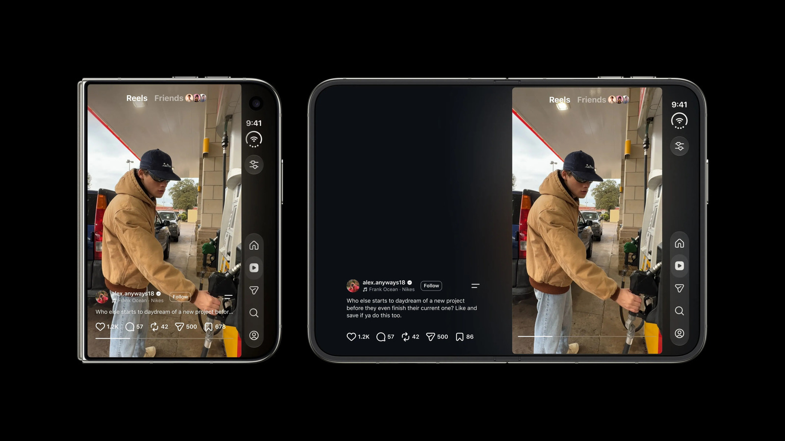
Instagram CEO Adam Mosseri stated that optimizing the app for the iPhone Duo’s unique wide, short form factor is 'pretty challenging.' While portrait mode works well for Reels, the device’s layout creates ergonomic conflicts with navigation buttons. The app launched globally on October 23 but has faced user criticism regarding its interface design on the specific hardware.
Key points
- Adam Mosseri, head of Instagram, acknowledged that designing the app for the iPhone Duo’s unique wide and short form factor is 'pretty challenging' compared to standard tall vertical screens.
- The iPhone Duo, a foldable device with a distinct horizontal orientation when open, presents specific ergonomic issues, such as double-stacked navigation and interaction buttons that disrupt user flow.
- Mosseri confirmed that while the larger screen in portrait mode offers the best experience for Reels, the team is actively working to improve the interface for other screen orientations.
- Instagram’s version optimized for the iPhone Duo has been available globally since October 23, though it has received significant user criticism regarding its current interface implementation.
- Users and Mosseri agree that the device’s non-typical shape requires significant reconsideration of button placement to ensure an ergonomic and intuitive user experience.
Design Hurdles for New Hardware
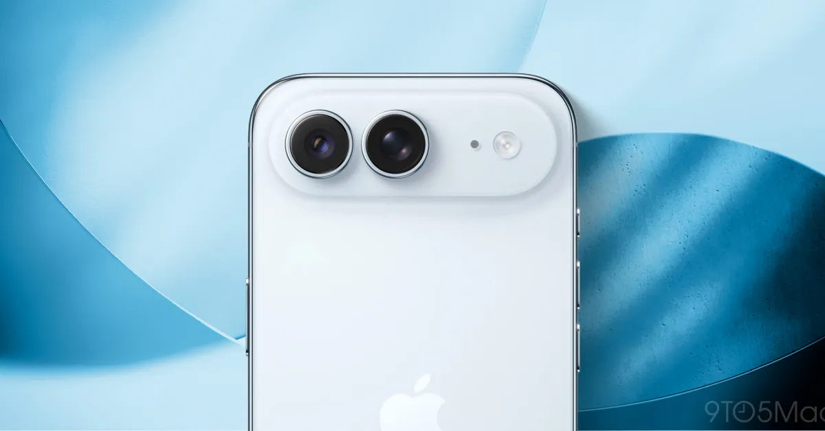
Adam Mosseri, the head of Instagram, has openly admitted that adapting the social media platform for the iPhone Duo presents significant design difficulties. Speaking on Threads, Mosseri described the task of creating an interface that feels great on the device as 'pretty challenging.' His assessment comes after a closer examination of the hardware’s specific technical details and physical form factor. The iPhone Duo is not a conventional smartphone; it features a wide and short profile even when folded, diverging sharply from the tall vertical screens that have defined mobile design for over a decade. This deviation requires Instagram to rethink fundamental layout principles that have been standard for years.
The Reels and Button Conflict
A primary area of friction involves the Reels feature, which relies heavily on vertical scrolling and full-screen video consumption. Mosseri noted that the best user experience on the Duo occurs in portrait mode with the larger screen open, as the image occupies most of the display. However, the device’s horizontal geometry creates ergonomic conflicts elsewhere in the app. Mosseri highlighted that while navigation buttons on the right-hand side make sense when the phone is closed, the same location houses the Like, Comment, and Share buttons during Reels playback. This results in a 'double stack of buttons' that Mosseri admitted 'doesn’t feel great' and requires immediate reconsideration by the development team.
User Feedback and Global Launch
The Instagram application optimized for the iPhone Duo was released globally on October 23. Despite the strategic push to support the new hardware, the app has encountered substantial backlash from users regarding its interface. Critics argue that the current design fails to leverage the Duo’s unique screen real estate effectively. In response to user comments on Threads, Mosseri engaged directly with the community, acknowledging that the current state of the app is not ideal. He agreed with users that the portrait mode experience is superior for video content but emphasized that the engineering team is actively working to enhance the experience across all orientations.
Broader Implications for Mobile UI
The challenges faced by Instagram highlight a growing trend in the tech industry: the need for software to adapt to increasingly diverse hardware form factors. As foldable and rollable devices enter the mainstream, app developers must move beyond simple responsive design. The specific case of the iPhone Duo demonstrates that physical dimensions can fundamentally alter user interaction patterns. Mosseri’s comments suggest that Instagram is not merely porting its existing interface but is attempting to reconstruct the user journey to fit the Duo’s distinct shape. This effort is critical for maintaining user engagement as hardware innovation accelerates.
What Happens Next
Instagram’s development team is now focused on resolving the button stacking issue and improving the overall ergonomics of the app on the Duo. While the current version is live, the public criticism indicates that further updates will be necessary to satisfy users. Mosseri’s willingness to discuss these challenges publicly underscores the importance of user feedback in the iterative design process. As more users adopt the iPhone Duo, the success of Instagram’s adaptation could serve as a benchmark for how major social platforms handle non-traditional screen ratios. The coming months will likely see significant updates aimed at smoothing out the rough edges of the current interface.
Key takeaways
- Adam Mosseri, head of Instagram, stated that optimizing the app for the iPhone Duo is 'pretty challenging' due to its unique wide and short form factor.
- The iPhone Duo’s layout causes ergonomic issues, particularly a double stack of navigation and interaction buttons that disrupts the user experience.
- Instagram’s version for the iPhone Duo launched globally on October 23 but has faced significant user criticism regarding its interface design.
- Mosseri confirmed that while portrait mode offers the best experience for Reels, the team is actively working to improve the app for other orientations.
- The situation highlights the broader difficulty mobile apps face in adapting to non-traditional hardware shapes like foldables.
Sources
The WireByte editorial team synthesises technology news from multiple primary sources, verifies the facts, and links every source. Articles are produced with AI assistance and reviewed under our editorial policy.