Google Wallet Redesign Sparks User Frustration Over Usability
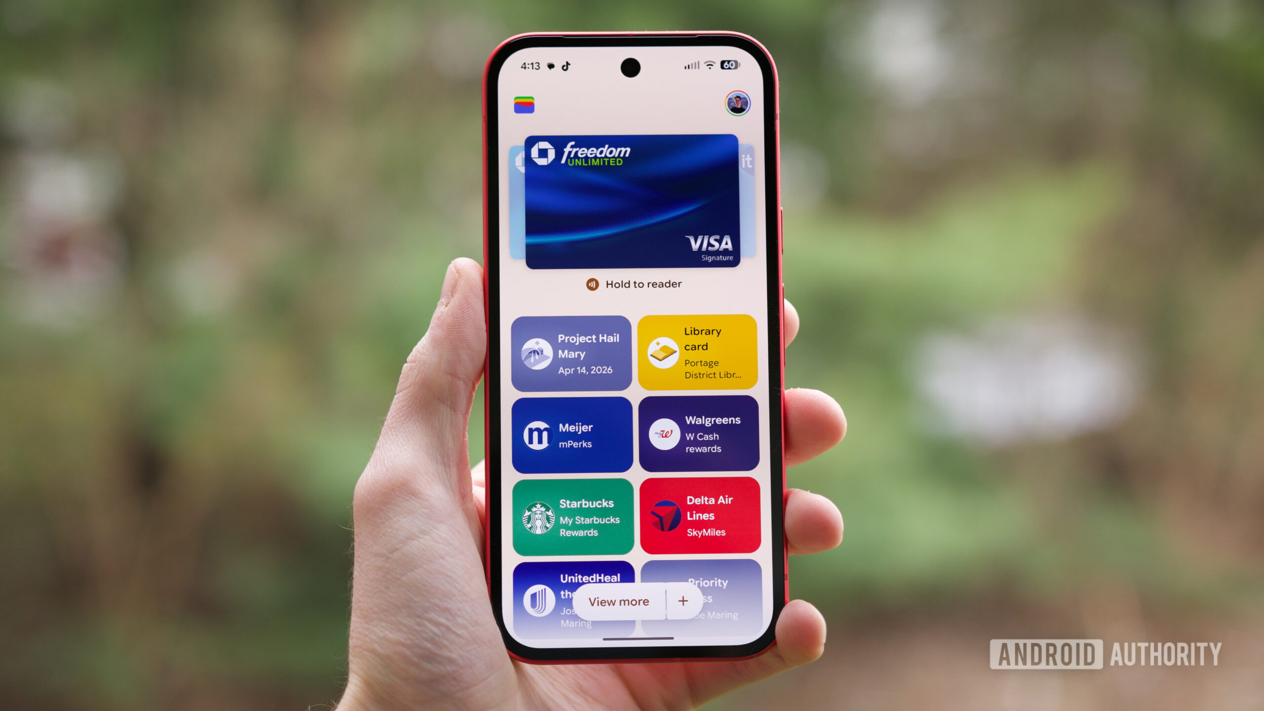
Google Wallet’s recent UI overhaul replaces horizontal scrolling with a vertical card stack, prompting user complaints about reduced clarity. Critics argue the new layout obscures card distinctions, particularly for users with multiple cards from the same issuer. While the redesign aims for a modern aesthetic, it has drawn criticism for prioritizing form over function, with users requesting clearer visual differentiation and alias details.
Key points
- Google Wallet, a digital payment and identity platform by Google, has implemented a significant user interface redesign.
- The update replaces the previous horizontal scrolling card layout with a vertically stacked card design.
- Users report that the new vertical layout makes it difficult to distinguish between cards, especially those from the same bank.
- Critics argue the redesign sacrifices usability for aesthetics, noting the loss of clear aliases and details under each card.
- The change has sparked debate among users, with many calling for improved visual differentiation in future updates.
Google Wallet has undergone a significant user interface overhaul, shifting from a horizontal scrolling mechanism to a vertically stacked card layout. This redesign, part of a broader refresh of the digital payment platform, has drawn mixed reactions from users who value the previous interface's clarity.
The primary criticism centers on usability. Users with multiple cards from the same financial institution report that the new vertical stack makes it difficult to quickly identify specific cards. The previous horizontal layout provided clear aliases and detailed information beneath each card, allowing for instant recognition. The new design, while aesthetically modern, obscures these details, forcing users to interact more deeply with the interface to confirm card selection.
This change reflects Google's ongoing efforts to modernize its app ecosystem, mirroring design trends seen in competitors like Apple. However, the backlash highlights the tension between aesthetic updates and functional integrity. Users are urging Google to reintroduce clearer visual cues, such as distinct card borders or enhanced alias visibility, to maintain the platform's utility for power users.
As the redesign rolls out globally, the response from the Android community suggests that future updates may need to address these usability concerns. Google has not yet issued an official statement regarding potential adjustments to the interface, but the volume of user feedback indicates a strong preference for clarity over stylistic changes. The situation underscores the importance of user-centric design in financial applications, where quick and accurate card selection is critical for seamless transactions.
Sources
The WireByte editorial team synthesises technology news from multiple primary sources, verifies the facts, and links every source. Articles are produced with AI assistance and reviewed under our editorial policy.