Google Completes Gradient Icon Rollout for Messages, Contacts, and Phone
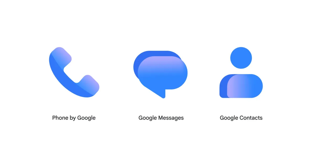
Google has finished deploying updated gradient icons for its core communication apps: Messages, Contacts, and Phone. The redesign, which began two weeks ago, introduces a lighter blue hue and sharper visuals to the existing circular layouts. The changes aim to modernize the Android interface without altering the fundamental shape of the app logos.
Key points
- Google, the technology giant, has completed a software update for its primary communication applications on Android devices.
- The update introduces a new gradient design with a lighter shade of blue for the Messages, Contacts, and Phone apps.
- The Contacts app received its update on Wednesday evening with version 4.92.26.x, following the Phone app's rollout on Monday.
- The Messages app update was released to stable users this week, finalizing the two-week deployment period for all three apps.
- The redesign maintains the original icon shapes but increases their size to better fill the circular background.
- Google describes the visual changes as sharper and crisper, aiming for a more modern aesthetic without disruptive functional changes.
Visual Refresh for Core Android Apps
Google has officially completed the widespread distribution of updated icons for its essential communication suite on Android. The rollout affects three of the platform's most frequently used applications: Messages, Contacts, and Phone. This update represents the final phase of a design initiative that began two weeks prior, marking the transition of these visual elements from beta testing to stable availability for the general user base. The changes are purely aesthetic, focusing on a modernized look while preserving the recognizable identity of each application.
Design Specifics and Timeline
The visual overhaul introduces a distinct gradient effect to the logos, replacing the previous solid color schemes with a lighter shade of blue. This shift is intended to make the icons feel less heavy and more contemporary. Despite the change in color treatment, the fundamental geometry of the icons remains unchanged. The Messages icon continues to feature overlapping chat bubbles, the Phone app retains its handset symbol, and Contacts still displays a head and body silhouette. However, the graphical elements within these circular backgrounds have been slightly enlarged to improve visibility and fill the space more effectively. Google has described the new Messages icon as "sharper, crisper, and clearer than ever before," emphasizing the improved clarity of the design.
Phased Deployment Across Applications
The distribution of the update occurred in a staggered manner across the three applications. The Phone by Google application was the first to receive the new gradient icon, rolling out to stable users on Monday. This was followed by the Messages app, which saw its update reach stable users later in the week. The Contacts app was the last to be refreshed, with the update arriving on Wednesday evening under version 4.92.26.x. This phased approach allowed Google to manage server load and monitor for any unexpected issues before fully deploying the changes across its entire Android user base. The entire process, from the initial announcement to full availability, spanned a period of two weeks.
Impact on User Experience
For the average user, the changes are subtle and non-disruptive. The core functionality of the apps remains identical, with no new features or interface alterations accompanying the visual update. The primary goal appears to be aligning the communication apps with a broader design language that emphasizes clarity and modern aesthetics. The update does not affect the underlying code or performance of the applications. Users will notice the change immediately upon updating their apps, as the new icons replace the old ones on their home screens and app drawers.
Future Developments
While the icon update for Messages, Contacts, and Phone is now complete, Google continues to work on other interface changes. A significant redesign of the Messages homepage is currently in the beta channel, suggesting that further visual and functional changes may be forthcoming. This ongoing development indicates that Google is actively refining its communication tools, with the icon update serving as one component of a larger effort to modernize the user experience. The stable release of the gradient icons marks a milestone in this process, ensuring that the visual identity of the apps is consistent across the platform.
Key takeaways
- Google has finished rolling out gradient icons for Messages, Contacts, and Phone on Android.
- The update introduces a lighter blue color scheme and sharper visuals to the app logos.
- The Contacts app received the final update on Wednesday with version 4.92.26.x.
- The Phone app was updated on Monday, followed by Messages later in the week.
- The redesign maintains original icon shapes but enlarges elements to fill circular backgrounds.
- A homepage redesign for Messages is currently available in the beta channel.
Sources
The WireByte editorial team synthesises technology news from multiple primary sources, verifies the facts, and links every source. Articles are produced with AI assistance and reviewed under our editorial policy.